Why vague labels fail
The phrase “wheelchair accessible” carries almost no information. It is used for a building with level entry, wide lifts and a compliant accessible toilet, and it is used for a building with two steps at the door and a member of staff willing to lift. Both statements can be made in good faith. Only one of them describes a place a powerchair user can visit alone, and the label cannot tell you which you are looking at.
The same collapse happens with the tick-box lists on booking sites. A single icon stands in for a dozen separate questions: how wide is the bathroom door, is there transfer space beside the toilet, does the lift take a chair plus a companion, is the accessible room on the ground floor or behind a fire door with a heavy closer. Travellers learn to distrust the icon and telephone the venue instead, which is a research task nobody should have to repeat for every trip.
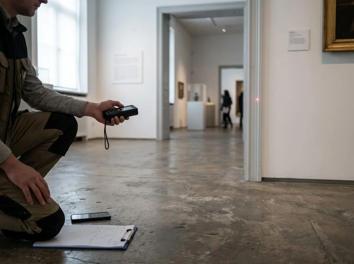
Numbers behave differently. A door is 78 cm or it is not. A ramp runs at 7% or it does not. Published as figures with a date and a source, those values can be compared between cities, argued with, corrected and audited. That is the entire reason this site records dimensions rather than adjectives, and why a profile that reads as dry is doing its job.
What we deliberately do not do
We do not publish a single score in place of the profile. A wheelchair user, a traveller with low vision and a family with an autistic child are not looking for the same building, and one number cannot rank a venue for all three. The score exists to sort and compare at a glance; the attribute list underneath it is the actual answer, and we always show it.
We do not promise that a place will be accessible. We report what was measured or published, and the date. Operations change on the day: lifts fail, ramps get blocked, quiet hours get cancelled for a school visit. Any site that guarantees your experience is guaranteeing something it does not control.
We do not sell position, ranking or score. There is no paid placement, no sponsored profile presented as editorial, and no arrangement in which a venue pays to have a figure softened. An audit client buys a measurement and a report, not an outcome, and a poor result stays published. We also run no user accounts, no newsletter and no review system, so there is no engagement metric quietly shaping what you are shown.
How coverage grows
Coverage expands city by city rather than everywhere at once, and it starts where it helps the most people: the destinations disabled travellers ask about most, and the venues within them that carry the highest visitor numbers. Within a city we work outward from the step-free transport network, because a beautifully accessible museum with no step-free station within a kilometre is a harder trip than its own building suggests.
Each city begins as a compiled layer. We assemble what the venues and operators already publish, record the gaps as unknown, and put the whole thing under a visible provenance label. That layer is genuinely useful on its own — it collects scattered documents into one comparable format — and it also shows us exactly which measurements are worth a visit.
On-site verification then follows the same order, prioritising the places where published claims are thin, contradictory or clearly out of date. Verified profiles will appear alongside compiled ones with the difference marked, and the proportion verified is something we intend to state openly rather than blur. Growth here means more measured figures, not more pages.